

Chroma Charters
Chroma Charters Brand Identity
Chroma Charters is San Diego’s sailing charter company. Female-founded and female-run, Chroma is inspiring millennials and their families to appreciate the beauty of our oceans in unique and safe way while taking part in protecting habitats for marine life.
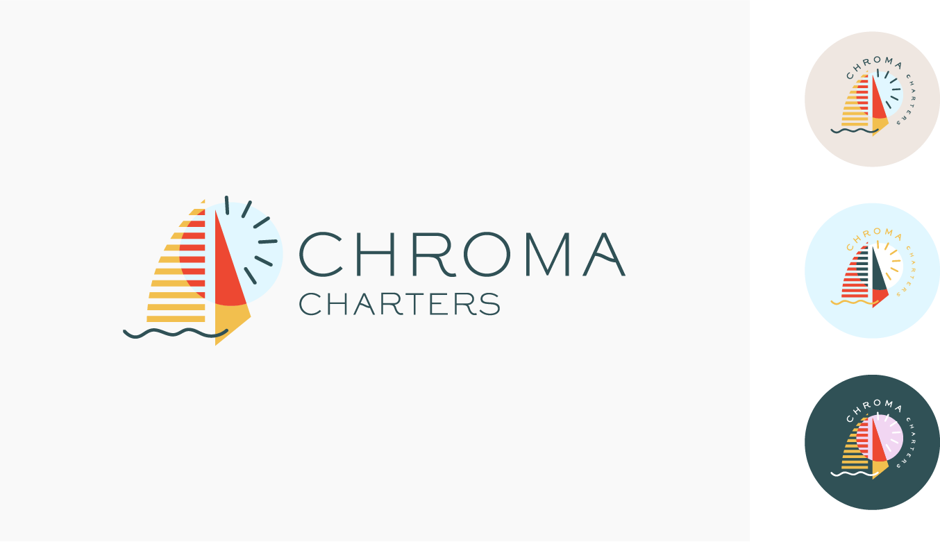
The branding captures various hues and various levels of brightness to reflect the desire to showcase the ocean’s dynamic chromas. While the logo itself maintains a sense of modern simplicity that appeals to its primary audience, the palette empowers a wide range of possibilities as the company continues on to create merchandise that aligns with its vivid spirit.


Chroma’s branding is as colorful and vibrant as the sights and experiences that clients will encounter, from the first moment Chroma pops up on their feed until long after the final wave goodbye when the boat docks. Interchangeability of colors and varied levels of detail in sub-branding make seasonal designs a possibility, as Chroma partners with a different ocean conservation nonprofit each quarter.
The concept of branding for Chroma Charters was part of a branding design challenge by MKW Creative in May 2020. Throughout this 3-week program, we went through stages of understanding the client, shaping the brand idea into visuals, creating sub-iconography, and applying the imagery to concept pieces that aligned with the Chroma Charter brand.


